

Digital Distortion Studies
- Photography, image-making, art direction
- Feb to Jul 2019
- Solo
I took portraits of friends and kept breaking the files until they started giving me something I had not planned. Colour channels shifted, grain became a surface, and compression decided what survived.
Five stills and one short motion piece, made between February and July 2019.
bbyrat
A portrait pulled apart by channel shifts, with a third eye added and 화성 tucked into the corner.
The scanlines started as compression artefacts. I kept pushing until they became the surface.
Anthony
I inverted and solarised the portrait until the room began to feel underwater, then brought in the jellyfish.
화성 runs down the left edge in magenta, closer to a border than a caption.
Close Up
The most editorial image in the series: grey bars across the frame, with a name, date and serial number in the margins.
The subject stays intact while the world behind them comes apart.
How far can a photograph bend before it stops feeling like one?
The source material was ordinary: portraits of friends, environments and things I had shot myself. I kept pulling the files apart to see what the pixels would do.
“I used the damage as material.”
The work started to sit somewhere between photography, collage and graphic design. The photograph was still there, but it no longer ran the whole image.
That unstable middle was the part I wanted to keep.
Where does an image end and its digital interpretation begin?
Between three disciplines
The photograph supplies the subject. Collage enters through the layering. Graphic design shows up in the type, margins and repeated marks. I borrowed from all three without asking the work to behave like any one of them.
The more I destroyed, the less there was to look at.
The useful range was narrow. Too little distortion looked accidental. Too much turned the image into noise.
What I did to the pixels

Four kinds of damage, each pushed by hand
There was no preset making the choices for me. I moved each effect until the photograph began to fight back, then stopped before it disappeared.
The techniques:
Colour channels separated and offset. The red and cyan fringing came from the photograph itself.
Grain pushed until it stopped feeling like texture and became a surface.
Compression repeated until the codec began deciding which details survived.
Pixel rows stretched and reordered into bands and blocks.
Giving the eye a way back
Putting part of the photograph back gave the eye somewhere to land.
A face, a hand or a garment stayed untouched inside the damaged field. That small piece of the original made the corruption readable again.
Why it works:
The intact fragment gives the eye somewhere to land.
Clean and corrupted areas make each other easier to read.
Holding both states keeps the image unstable without losing it.
One tall still and a six-second motion piece.
The 4:5 format let the work fill the frame. “99%” stayed a still. The second piece moves.
99% and the six-second motion piece
Korean fashion photography, editorial layouts and 화성 all left a mark.
I was looking closely at saturated fashion photography, unusual crops, magazine furniture and experimental type. Those references became specific choices in the images.
Korean fashion photography
Colour that refuses to behave naturally
Hot pink sat against acid green. Purple pushed into red. I also borrowed the odd crops and off-centre portraits that let the background compete with the person.
Where it shows:
Colour pushed past naturalism on purpose
Portraits framed low, close, or partly obscured
Editorial design
Magazine furniture used as texture
Vertical type, date stamps, serial numbers and grey bars came from magazine layouts. They do not label the image. They are part of it.
What appears in the work:
Vertical type set in the margins, carrying a name and a date
Serial numbers that look like filing and mean nothing
화성
Mars, as a signature
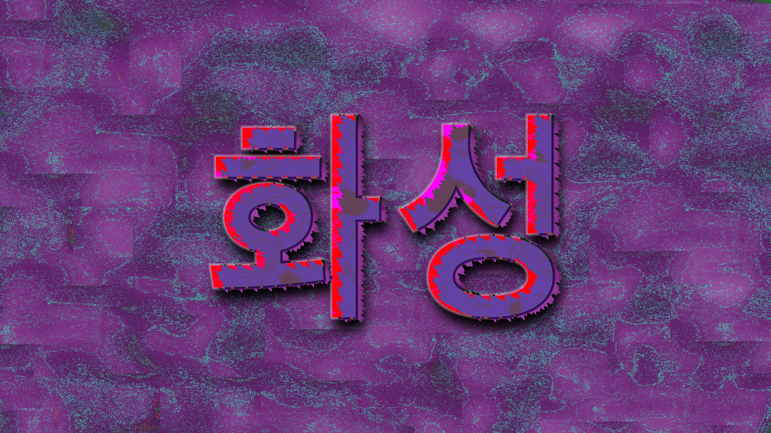
화성 means Mars in Korean. It appears large in one piece, small in a corner of another and down the edge of a third. It became my tag for the series.
How it is used:
As the whole subject, distorted into a typographic piece
As a small mark in a corner, the way a photographer signs a print
Repeated vertically as a border, closer to pattern than to text
I made the series between February and July 2019.
What I would keep, and what I would change.
If I made this again, I’d bring my friends into it earlier. I’d mix their photos with mine and see what happens when the source material comes from more than one point of view. I’d keep the mess and experimentation. This time, I’d give the series a clearer story and ask each image to carry more meaning.
Thank you.