

Bombardier - MyBA
- Lead Product Designer & UX Researcher
- 35 weeks · 2024 to 2025
- Cross-functional team of 16
Work Arising is the approval experience inside MyBA, Bombardier’s customer portal. When a jet is in for service and technicians find extra work, the owner has to approve it before anything can start. Delivered to engineering for the July 2025 beta.
200+
6
<90s
How do you turn a 200-page maintenance document into a decision someone can make in five minutes?
When a business jet comes in for service, technicians find extra work that wasn't in the original order. A hydraulic leak. A worn part. Each needs the owner's approval, and until they sign off the aircraft sits.
They found out through a PDF. Sometimes over 200 pages. Hydraulic leak on page 47. AD compliance on page 112. Navigation inspection on page 189. Find the ones that need you, price them, reply by email. The aircraft sits costing money by the hour.
Reps fielded the calls and heard the same questions every time. What's the number for this job. How much will it cost. Does it have to happen now. None of it was in the PDF.
The brief I was given was “design the approval flow.” That wasn't the problem.
Who I was designing for
A Director of Maintenance managing a fleet of 50. An owner-operator with one jet who leans on advisors. Different people, same moment: short on time, approving work they didn’t write, often worth five or six figures.
Both needed enough context to approve without calling the service centre. That shaped almost every decision I made.
Four surfaces, and the version of each I threw away.
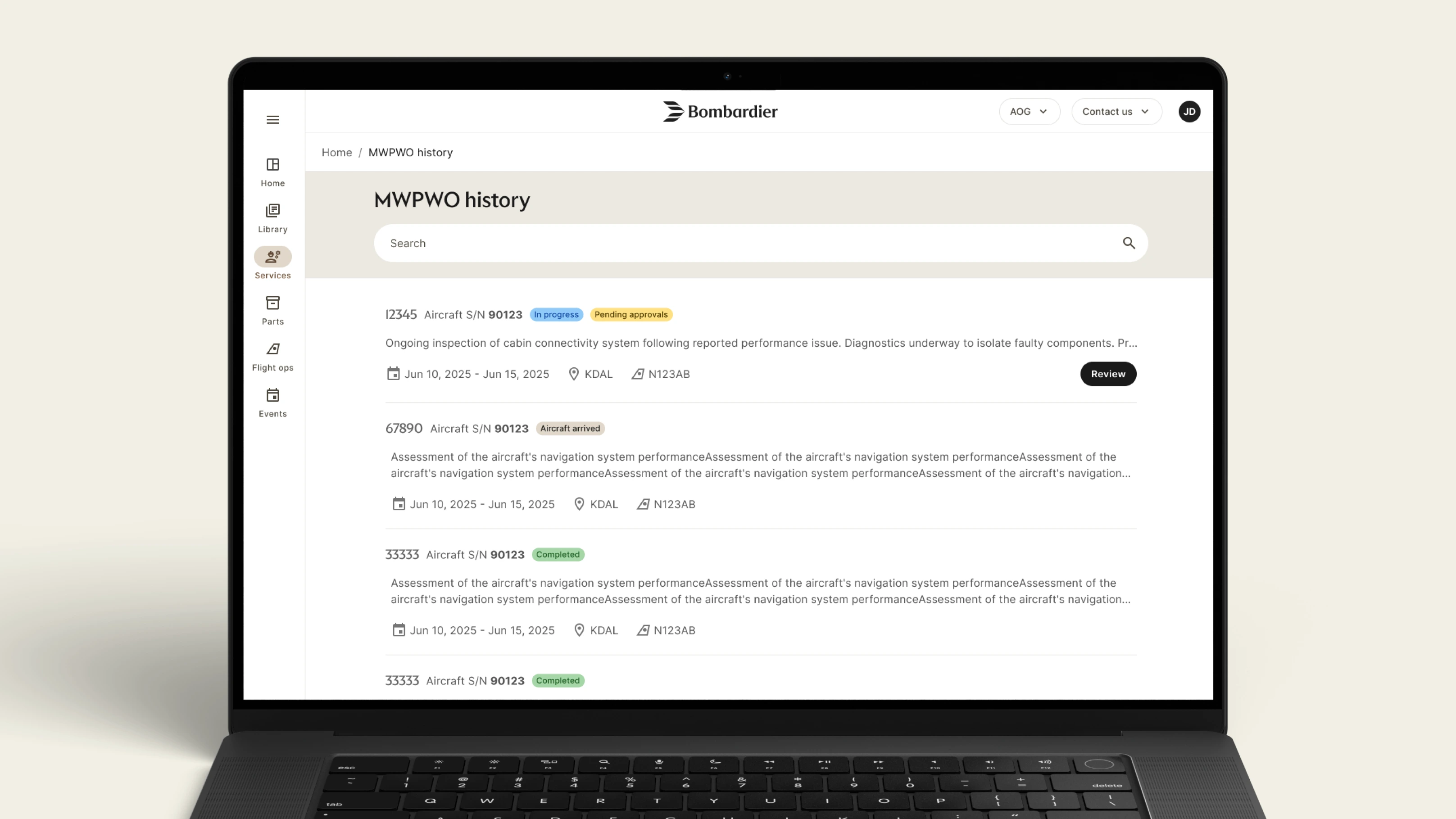
List view
I kept cost off the card at first, because showing money early pushes people toward “is this expensive” before “is this necessary.” I was wrong about the stakes. These approvals run to hundreds of thousands. Customers needed to see their exposure before they opened anything, so cost came back.
So cost returned as three totals at the top: pending, original and accepted. Aggregate exposure stays up front, with the line-by-line breakdown one level down where there is enough context to judge it.
Each row leads with SOCN, the serial customers use in their own systems. Triage happens through the filter and the colour, not field order. The list opens already filtered to Pending approval, and the pending pill is the only yellow on the page.
Job overview
The segmented bar beat a bare percentage. We tested both. 46% makes you do arithmetic, while the bar shows that it is a little under half. Three counts sit under it: pending, accepted and completed. Those are the questions people open this page with.
The old PDF stayed. We moved it into a supporting role instead of removing it, because some customers still work that way and taking it away would have cost us trust we needed.
Approval detail
This is where customers commit money, sometimes tens of thousands on a single item. Cost splits into labour, materials, and other. We considered one total with an expandable breakdown, but customers needed to be able to question one line without rejecting the whole thing.
Attachments sit beside the cost, not behind a tab. If a technician uploaded a photo or an inspection note, it is right next to the amount you are being asked to approve.
Two actions sit side by side at the same size. Asking a question is a valid outcome, not a failure to decide.
Multi-select
A fleet operator approving fifteen items shouldn’t repeat the same flow fifteen times. Multi-select batches them into a single estimated total, with the same two actions waiting at the end.
Selection is explicit, and that wasn’t my first instinct. I wanted the whole card clickable with the review button as a secondary option.
The PM pushed back. As the card picked up multi-select and status changes, a fully clickable card would start colliding with itself. He was right. A dedicated button scaled better.
We made the deadline. Then 30% came back.
My plan was simple: start with service reps and SMEs, then talk to four to six customers before designing.
Four weeks in, a VP review landed on the calendar. The room expected screens, and the date wasn’t moving. I used SME input to build the prototype and get us through the review.
When I finally tested it with customers, about 30% needed rework. I led the A/B testing, rebuilt the prototype and ran the redesign.
We still delivered the flow to engineering. But the six weeks of rework came from a risk I had already seen and didn’t raise soon enough.
The research I cut

The plan didn’t survive the calendar.
Service centre reps hear customer questions every day, so they were the fastest way in. SME workshops would map what the information actually meant. Customer interviews would tell us whether any of it landed. That last part is the part that got dropped.
What the plan had in it:
Interviews with the service centre reps who field the calls
SME workshops to map the information hierarchy
Four to six customer interviews before any design
A validation round once the first prototype existed
What came back
About 30% needed changing
No single issue was catastrophic. A label here, an abbreviation there. Together they cost six weeks, and customer interviews would have caught them earlier.
What we had to fix:
Labels that made sense to SMEs and not to customers
Abbreviations left unexplained because the experts used them daily
The internal Work Order number, where customers use SOCN
Status wording across every confirmation message
From opening a job to deciding on one item, under 90 seconds.
The flow as it was handed to engineering. The customer lands on the job and status pulls the eye to what needs them. A single Work Arising shows the three-line cost, visible attachments and two actions. The multi-select pattern at the end batches a fleet operator through fifteen items without repeating the flow.
Thirty fields came out of the PDF. Six made it onto the card.
The card you just saw carries six fields. The source PDF carried more than 30 for every Work Arising, including ATA chapter, task references, part numbers, labour hours, cost breakdowns, technician initials, regulatory notes and sign-off details.
I couldn’t show all of it. The card had one job: support a fast approval decision.
Six survived: SOCN, task number, a plain-language description, cost, status and attachments.
The sticky-note test
One question, asked about every single field
We put every field from the PDF on a sticky note. Then we asked the same thing about each one. Would removing this change the user’s decision to approve or reject?
The workshop turned up something I hadn’t expected. Customers didn’t recognise work by the internal Work Order number at all. They knew it by SOCN, the serial they use in their own systems.
How we sorted them:
No — moved out of the flow
Sometimes — available in detail
Always — stays on the approval card
Designing against what the platform could actually give us
Some fields customers wanted had no API behind them
Engineering and I went back and forth on what we could pull from the data systems. A few of the things customers asked for simply weren’t available, and faking the integration wasn’t an option.
What that forced:
Request more info collects a reason and a comment, then generates an email to the service centre
Email and phone were already how these conversations happened
Notifications were cut from the MVP entirely
I trusted the experts on language. The customers didn’t understand it.
SMEs use ATA, AD, SOCN and MWPWO every day, so I assumed customers did too. In testing, one fleet owner made it clear that several of those abbreviations meant nothing to him.
I led a pass across every label, status and confirmation message. The PM and PO helped tighten the wording, and SMEs helped us check the technical details.
What testing changed
Sessions with pilots, technicians and Directors of Maintenance
What came out of those sessions:
A full language pass across labels, statuses and confirmations
SOCN promoted to the front of the card, Work Order number demoted
Plain-language descriptions added beside technical references
Confirmation messages rewritten around the customer’s next step
The customer decides faster. Everyone waiting on that decision moves sooner.
Approval is the gate on starting work. When a customer is stuck in a 200-page PDF, the service centre can’t begin either, and the aircraft holds its slot on the ground.
Speeding up that decision unblocks three groups at once. Customers stop calling to ask questions the screen now answers. The service centre starts work sooner. Bombardier gets aircraft moving again.
What I’d have measured in beta
Design wrapped before the beta ran, so these are the numbers I’d have watched
Each one tests a specific decision. If the number came back wrong, the decision was wrong, and I’d want to know which.
What I’d watch, and what would prove me wrong:
Approval turnaround end to end, read against aircraft ground time
Request more info usage. Zero would mean the button was theatre
PDF downloads over time. They should fall
Drill-down rate into the detail view. High would mean the card is missing something
Partial cost queries against outright rejections
What got cut, and what I’d pick up first.
- Notifications. They didn’t make the MVP, so nothing tells a customer a new Work Arising is waiting for them.
- The fields with no API behind them. Some of what customers asked for still isn’t there.
- A way to compare a quote against similar past work, which came up in interviews and never got built.
- Smarter defaults for fleet operators who approve the same categories of work over and over.
I was wrong in two of the three big arguments, and the work got better.
The hard part wasn’t fitting information onto the card. It was deciding what someone needed before approving five or six figures.
I saw the research risk in week four and didn’t raise it. That’s the one I’d take back.
I was wrong in two of three arguments with my PM. Listening made the product better than the version I first wanted to ship.
Debate one · how much belongs on the card
The PM wanted more fields back on the card
His point was fair. These are technical users and they can handle information. My argument was that being able to handle complexity doesn’t mean wanting it upfront. Every field we removed had workshop data behind it, so the card stayed focused. This is the one I won.
Debate two · whether the whole card should be clickable
I wanted the full card clickable. The PM didn’t.
He said it would cause interaction problems as the card picked up more actions over time, like multi-select and status changes. He was right. A dedicated button made the interaction clearer and scaled better, so I conceded.
Debate three · language
I trusted SMEs on terminology and they were too close to it
ATA, AD, SOCN, MWPWO. Everyday vocabulary for the experts, opaque for a fleet owner. Testing exposed it and we ran a full language pass. Six weeks that earlier customer interviews would have saved.
Thank you.