

Promensil
- UX research and survey design
- 16 weeks · Nov 2021 to Feb 2022
- With a lead designer
Promensil sells a red clover supplement for menopause symptoms. They wanted a survey to learn about the women buying it, and a landing page to run it from. The questions they had drafted pushed people toward the product, which meant the answers were only ever going to agree with them.
16
2
6
Where the work landed.
A calmer landing page and a survey rewritten so the answers could disagree with the brand.
Finished experience · open to view the full page
A question that asks how much something bothers you has already decided that it does.
Promensil wanted to understand the women buying their product, and a survey was the way to do it. The draft asked things like how much a symptom disrupted your day. That phrasing assumes the symptom, and assumes the disruption, before the person has answered anything.
“Every question that leans gives you an answer that leans.”
Repeat that across a survey and the report comes back agreeing with whatever the brand already believed. That is worse than having no data, because it looks like evidence and gets used like evidence.
So the job stopped being to write a nicer survey. It became to write one where the answer was allowed to be no.
How might we ask women about menopause in a way that lets the answer be no?
Who it was for
The brief focused on women between about 40 and 60 who were somewhere in menopause and weighing up whether a supplement was worth trying. It positioned Promensil as an alternative to hormone replacement therapy, so the page had to feel credible without pretending to be medical advice.
I read the site Promensil already had as if I’d just landed on it, and wrote down what it was telling me.
I was looking for what a first-time visitor would understand, not making a visual punch list.
What the site was saying

It pitched before it explained
The product came first and the context came second, which is the wrong order for someone still working out what is happening to her.
What stood out:
The page led with the product before explaining the subject
Menopause itself was barely explained, so the site assumed you already knew where you were
The tone sat closer to a promotion than to health information
The design was dated enough to undercut the science the brand was leaning on
What that meant for the survey
The questionnaire inherited the same voice
The survey had been written in the same register as the marketing, which is how the leading questions got there in the first place. Fixing the tone of the page and fixing the tone of the questions turned out to be one job.
What had to change:
Explain the subject before offering the product
Keep the page calm enough that a personal question doesn’t feel like a sales step
Write the questions so they don’t assume the answer
I reviewed the category and kept finding two voices. Neither sounded like a person.
I reviewed Balance, Ritual, and OPositiv to see how the category handled a subject people do not enjoy discussing.
The clinical end
Authoritative, and cold
Some brands lean hard on medical credibility. Studies, dosages, clinical language. It earns trust, and it reads like a pamphlet handed to you in a waiting room.
What it does well:
Makes the science easy to believe
Avoids overpromising
Treats the reader as capable of handling detail
The commercial end
Warm, and selling
The other half is bright and relentlessly positive. Everything is a solution, every symptom has a fix, and the tone stays cheerful through subjects that aren’t.
Where it breaks:
Enthusiasm reads as pressure when the subject is personal
Promises of relief can make the reader sceptical
It leaves nowhere to stand for someone who just wants to understand what is happening
What nobody was doing
Explaining it without selling it
The gap was a brand that treats menopause as something you are living through and would like explained, and puts the product second. That became the tone target for the page and for the questions.
What that meant in practice:
Name the symptoms plainly instead of talking around them
Keep the science visible without letting it become the whole voice
Let the product remain an option, not the predetermined conclusion
This was desk research. I had not spoken with customers, so I kept the conclusions narrow: I could describe the language the category used, but not how women felt about it.
I rebuilt the questionnaire in Typeform so the answers were allowed to disagree with us.
My rule was simple: a question could not contain its own answer. No persuasive adjectives, no assumed symptoms, and a way out when something did not apply.
What was wrong with the draft
The questions assumed their own answers
If a question assumes disruption, someone without the symptom has no honest option. The lowest score still records a symptom that was never there.
How branching fixed most of it
Ask what is happening, then follow that thread
The survey first asked what someone was experiencing, then branched from there. If hot flashes did not apply, those questions never appeared.
What I can’t show you
I don’t have the question set any more
The Typeform is gone and I didn’t keep screenshots, so I can’t put the before and after side by side. I’d rather say that than rebuild questions from memory and present them as the originals.
The page had to feel calm without looking like it was hiding the evidence.
The opening
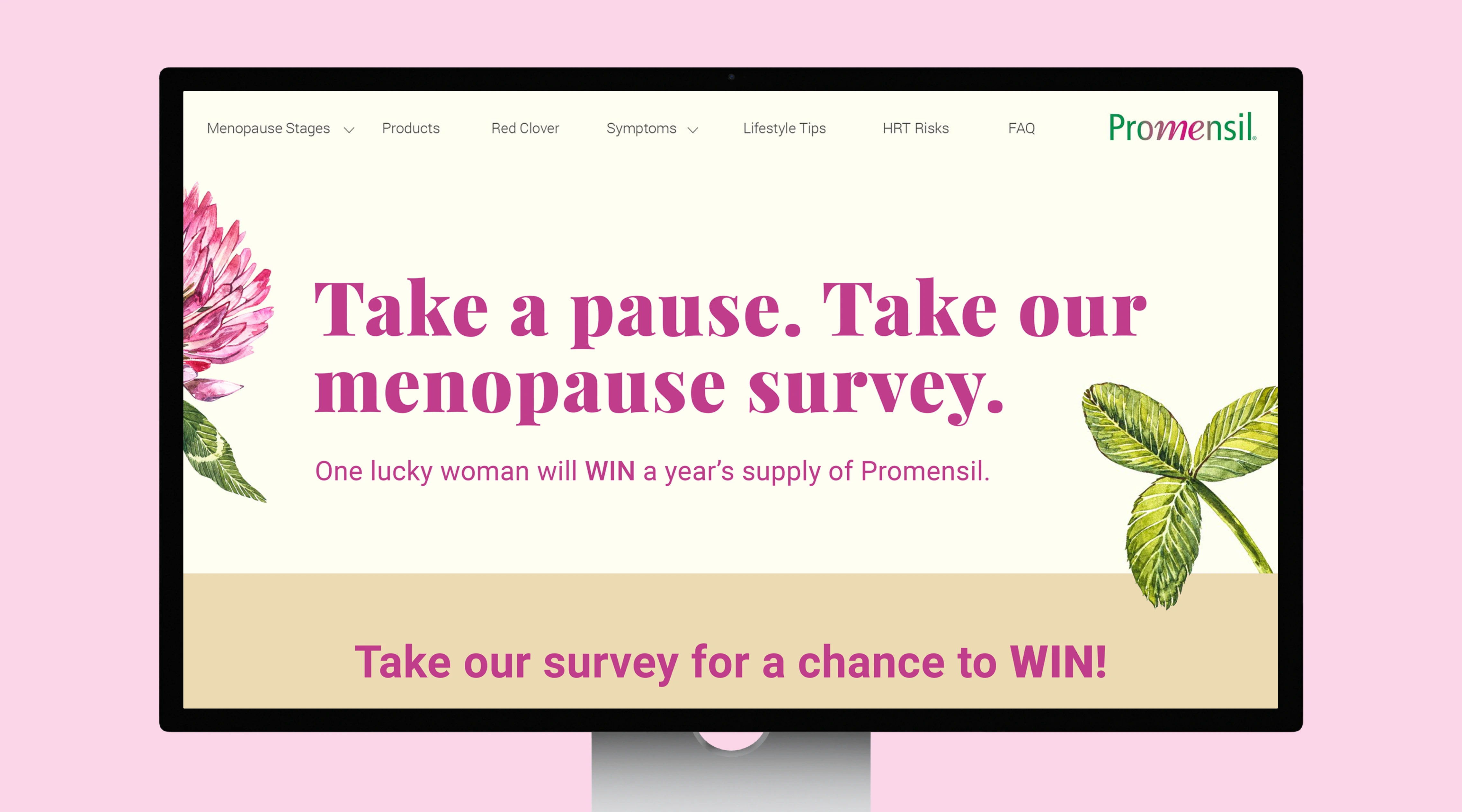
The page opens with the survey and the incentive. Someone landing here is already curious, so the first ask is the one we actually needed.
Botanical illustration instead of stock photography of women gazing out of windows. Red clover is the active ingredient, so drawing it does two jobs at once.
The positioning
The 2021 brief positioned Promensil as an alternative to hormone replacement therapy. That was the sentence the page needed to explain clearly, so it sat high in the layout and stayed in plain language.
Both strengths sit directly underneath it, so someone deciding between them can see the difference before scrolling into either.
The symptoms, named
Six symptoms, written out with an icon each. Naming them plainly does the reassuring. A reader can recognise her own experience in a list without being handed another promise.
This band is also what the survey had to cover, so the page and the questionnaire ended up sharing a vocabulary.
The product blocks
Each strength gets its own block: what it is for, what it reduces, what it supports, and where to buy it.
The pink panel carries the claims so the copy beside it can stay conversational. Separating the two keeps the page from reading like packaging.
Both strengths use the same block structure. The content changes, but the reader does not have to relearn the layout to compare them.
The finished page, top to bottom.
A short walkthrough of the live page, running from the survey prompt at the top, through the positioning and the symptom band, into both product blocks and down to the studies at the bottom.
35-second walkthrough of the finished page · open to view the full page
I was the one doing the research. I wasn’t the one making the final call.
I worked with a lead designer who made the final visual decisions. We talked through the direction while the work was happening, and I learned from that process. My part was the research and the survey: auditing the old site, reviewing how the category spoke, and rebuilding the questionnaire so it stopped leading people. I want that division of work to be clear.
What I don’t know
Nobody set up a way to tell whether it worked
The survey went live and I have no completion figures, no comparison against the old questionnaire and no read on whether the data got better. Analytics was on the site, but agreeing what to measure was never part of the brief and I did not push for it.
What I’d watch now:
Completion rate against the old questionnaire, from the same traffic source
Drop-off by question, to find the ones people won’t answer
How often the branching exits actually get used
Whether answers spread out or cluster, which is what tells you the leading is gone
What I’d do differently.
- Instrument it before launch. I have no idea whether the rewrite improved anything, because nobody agreed on a measure before it shipped.
- Talk to actual women. Everything I concluded came from reading the old site and the competition, and desk research only takes you so far.
- Keep the artefacts. The question set is gone, which means the most interesting part of this project is the part I can’t show you.
Thank you.